Client: University of Michigan Black Alumni (UMBA)
Team: Ben Kozlowski, Nida Hameed, Judy Ng
Timeline: October 2020-December 2020
Problem Statement: UMBA's website struggled with usability, engaging users, and relevance to the audience
Description of what our team accomplished:
First, our team analyzed the website's Google Analytics in order to learn more about their users. From the analysis, we presented recommendations in a slide deck report to the client.
The decrease in engagement is most likely due to the pandemic. The main activities on the site, such as looking up events or purchasing tickets, are no longer occurring.
We also submitted an insight analysis report to the client. Our team analyzed seven other Black Alumni websites to generate recommendations for the potential design and interactive features of the UMBA website. It was helpful to see how similar organizations structured their content. I worked on researching the calendar and store pages of other Black Alumni websites.
Homepage:
Donation Page:
Calendar:
Store (eCommerce):
Below are the redesigned medium-fidelity wireframes for the main features of UMBA’s website. This is the first iteration. The wireframes that my team and I worked on and presented to the client can also be viewed in the Figma link here. To view the prototype, click the button below.
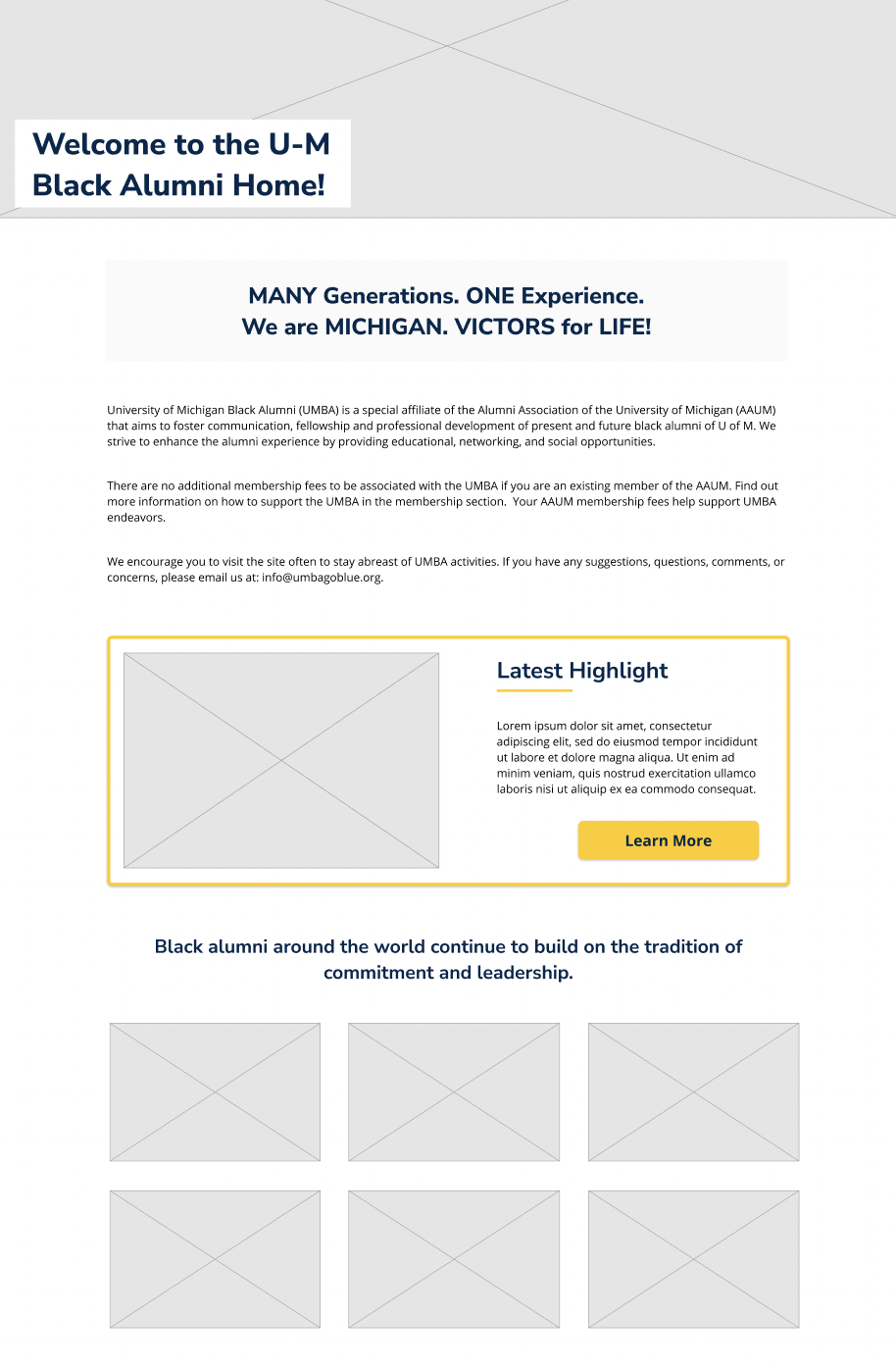
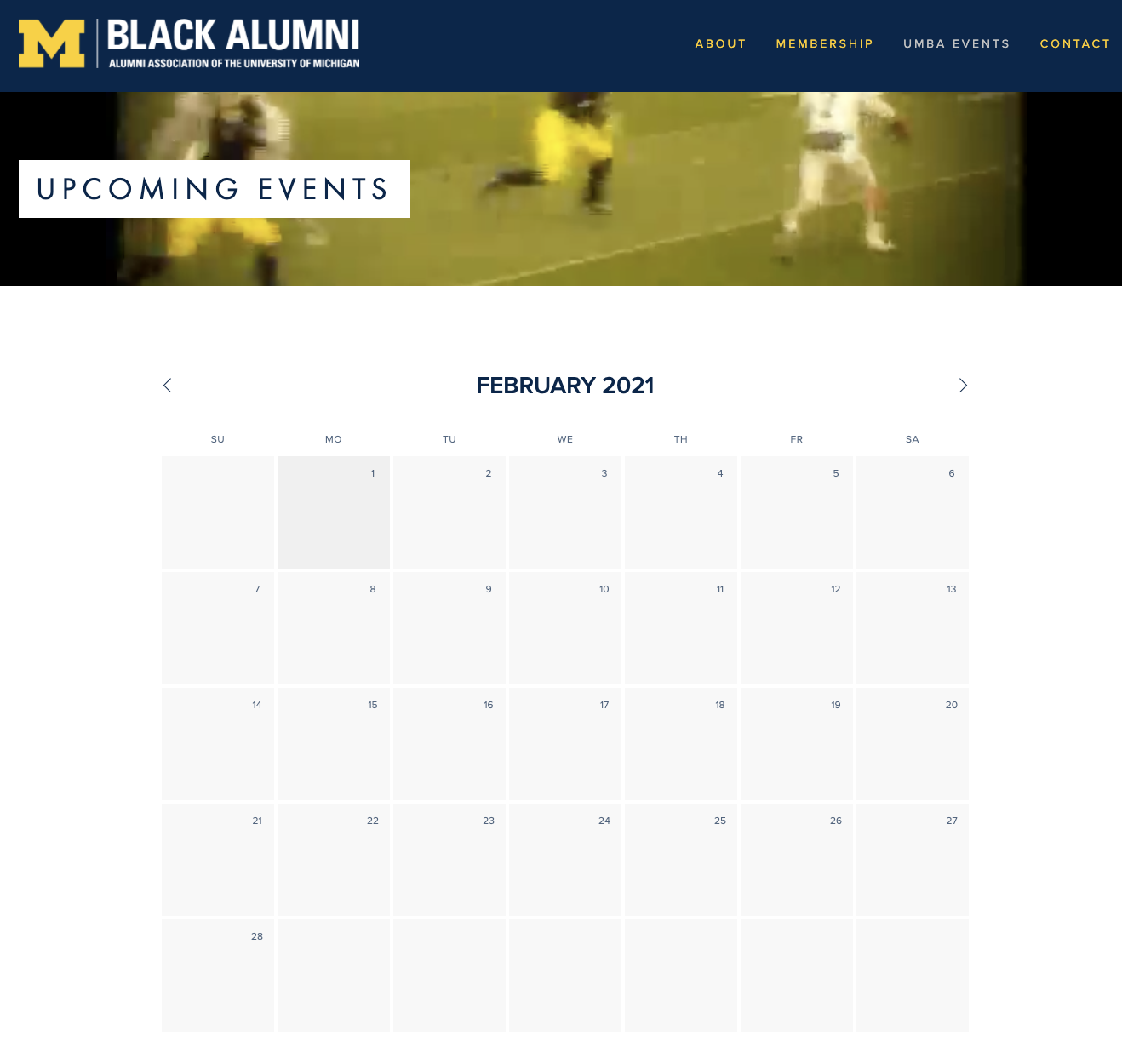
In our home page redesign we focused on including dynamic content and pictures and not overloading the page with text. The home page should be engaging, it should encourage people to join UMBA. This is why we have image placeholders that will show the organization members. In the new version, UMBA can use the highlighted call out box to draw attention to important organization updates and upcoming events.
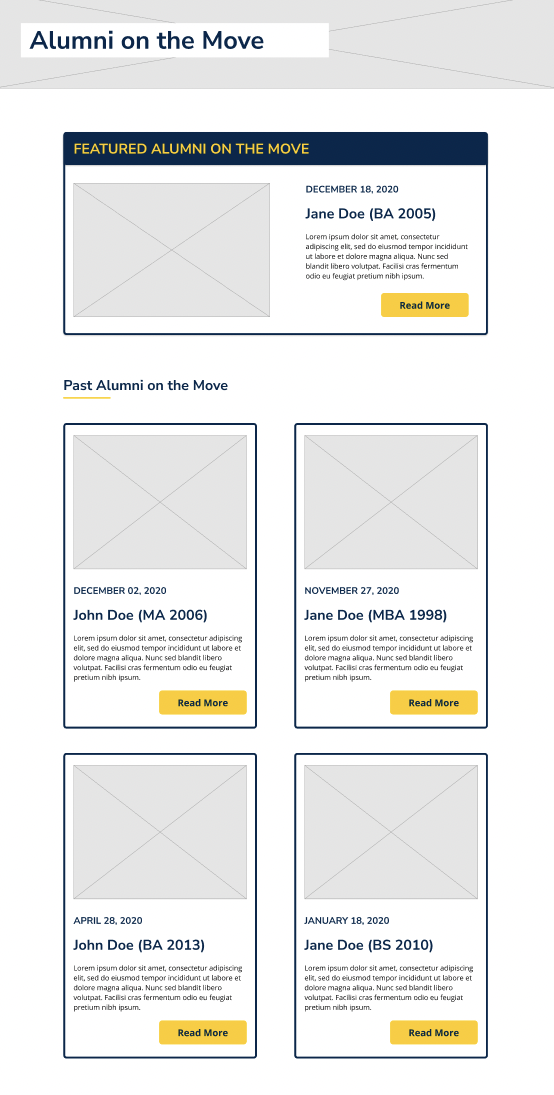
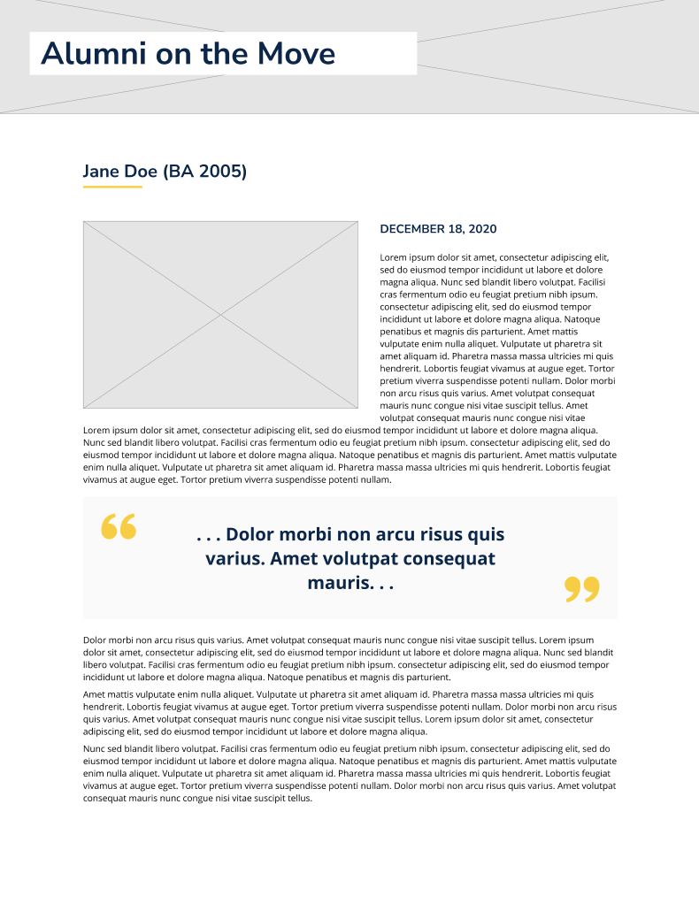
We created a new section where a visitor will find "Alumni on the Move," a section about alumni and their life updates. By creating a news section, users will immediately know where to navigate to find current and refreshed content. The client can also place a blog in this section later down the road if desired.

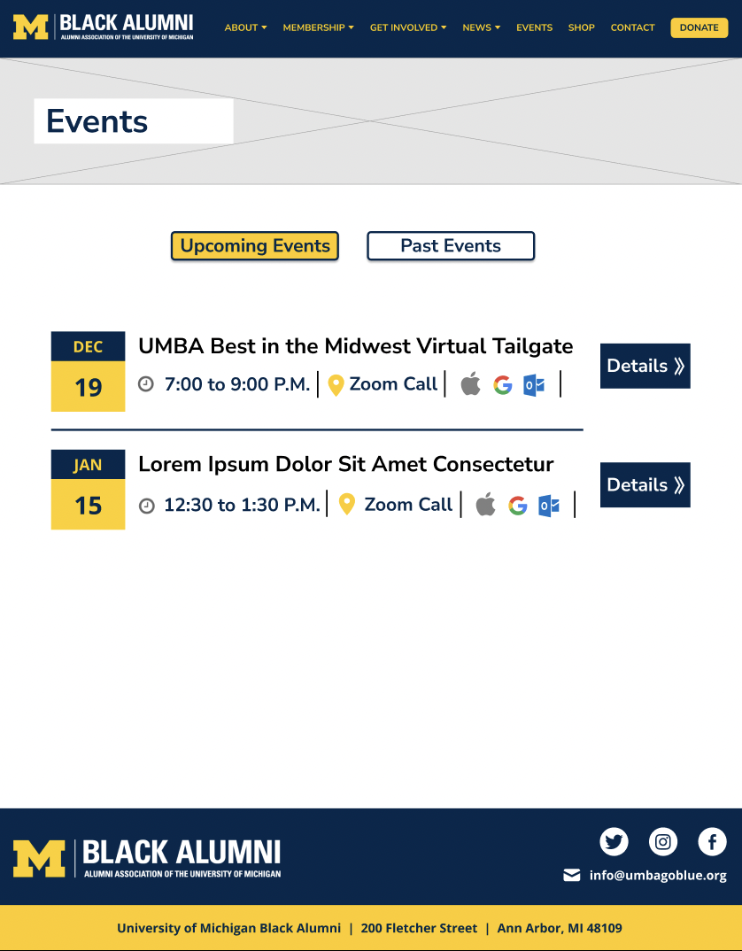
In the redesign, I presented events as event cards. This is a quick way to glean information about events . Our design plans for giving users the ability to download events directly to their calendar. We included an events details page, so visitors can be sure they’re attending events that interest them. We also added a past events section; this will help members find events that appeal to them and document UMBA’s good times.
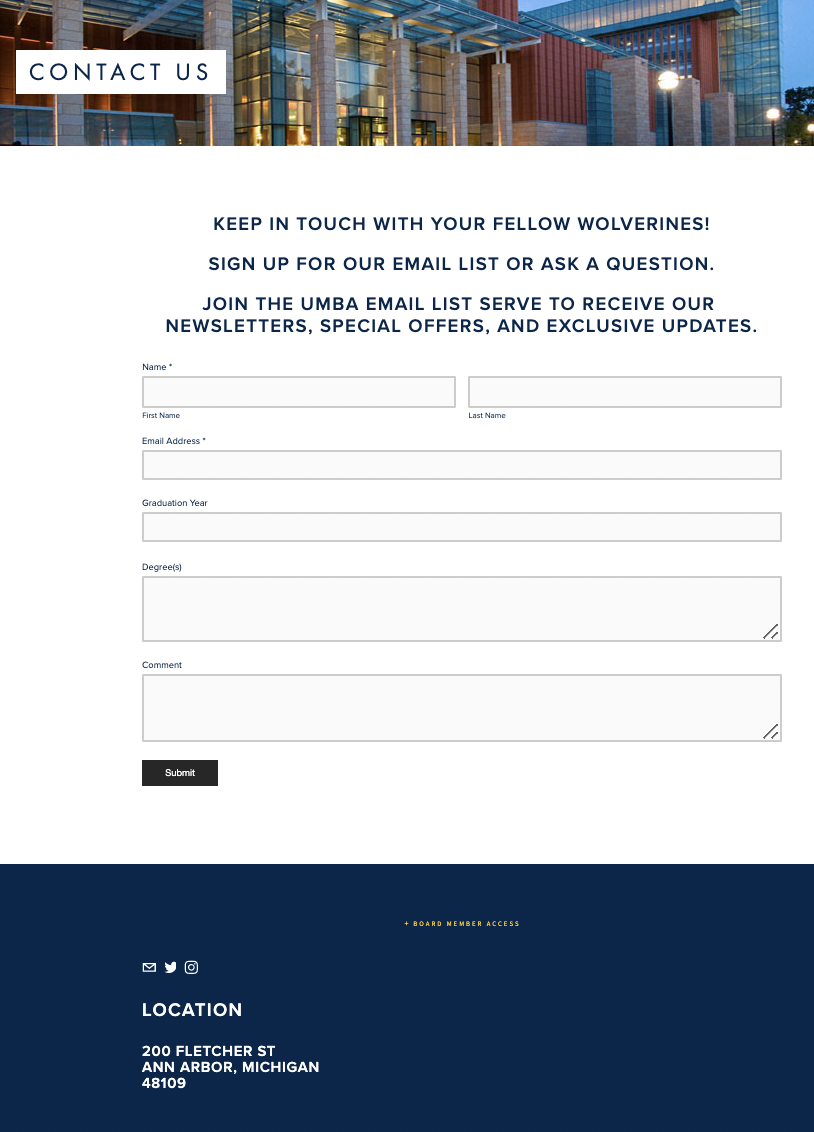
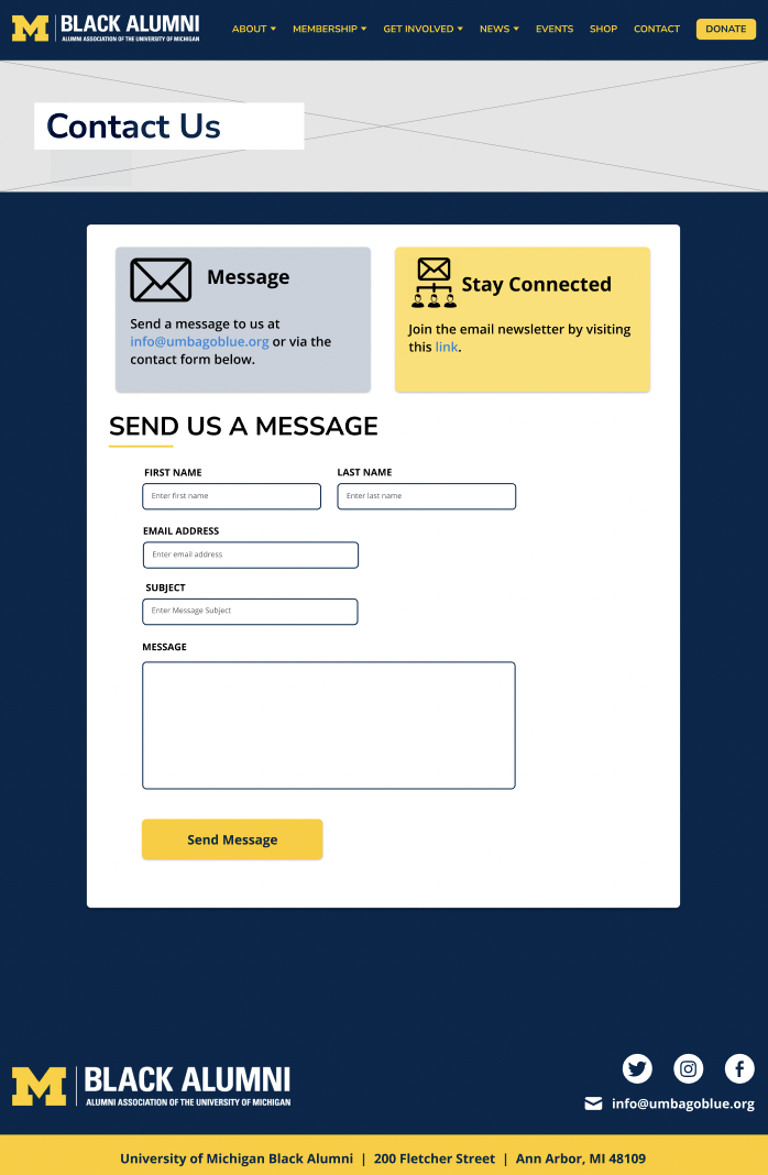
In the past, the only way to contact UMBA was to fill out this contact form. In our redesign, the contact page includes information about ways to contact the organization and join their mailing list. We encourage communication through different methods displayed in the cards “Message” and “Stay Connected”. We give users the option to send an email, join the email list, or fill out the contact form.
In our design, we used recognizable icons and created a more aesthetically pleasing page. We switched the uppercase text in the before image to sentence case in order to improve readability. According to Dieter Rams' 10 principles for good design, good design is honest. In keeping with this principle, we made the length of the fields a better representation of how many characters the user is expected to type in. We also updated the aesthetic of form fields to be more modern and efficient. The contact form no longer asks for alumni’s graduation year or degree(s). Asking these questions is often unnecessary and causes site visitors to spend more time filling the form out.
Click on the images for them to appear larger and to find out more about the shop.
Our client wanted to add a shop to the website for UMBA’s 45th anniversary. Because this was a new feature, our team designed it from scratch. Our insight analysis, where we looked at the eCommerce section of other black alumni websites, inspired this design.
Our goal was to create a clear user flow where the user knew where they were in each step. We also wanted users to be able to easily fix mistakes, so under the review page, the user can easily edit their item selection by clicking "Edit" and making the changes in an overlay window without navigating away from the current window. Also, when checking out, a summary of the visitor’s purchases is displayed to the right of the page; this helps reduce the user's cognitive load on their working memory since they can read the summary instead of trying to remember the items that they previously selected.


We updated the navigation bar and its subpages, and condensed information to make for a smoother user experience.
Before the site had difficult-to-read, uppercase text in many places. The site also packed too much information on a page. We standardized the fonts and broke up content.
There was a lot of uncharted territory that came with this redesign. We used inspiration from other sites and explored new ideas to create a donate, news, and store section.
We updated logos, added more images, improved grouping, and followed recent design standards, in order to make a more aesthetic, digestible site.
Creating a more understandable contact page and updating our header makes reaching out to the organization easier